CSCW 2018 Conference: Jersey City, New Jersey

Hi!

I’m Jennifer, Class of 2018. I was a Biological Sciences Major and I’ve just started working in the HCI lab as a research fellow. This November, I travelled to Jersey City, New Jersey, with a Wellesley College delegation to attend the 21st ACM Conference on Computer-Supported Cooperative Work and Social Computing (CSCW).

20181104_141113.jpg

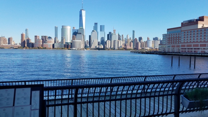
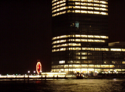
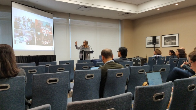
The venue at the Hyatt Hotel on the Hudson River was well chosen. It had a stunning backdrop of the Hudson River with New York’s manhattan a short PATH ride away. Colgate’s Clock provided an additional surprise on a darkened horizon, shown below.

Image result for new jersey colgate clock tower

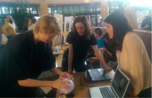
The conference was well attended but I didn’t find it overwhelming – a welcome observation considering that it was my first time attending a workshop and conference. I had an eye-opening experience, especially with the Sunday Workshop on Social Issues in Personal Informatics: Design, Data, and Infrastructure”.

20181104_100354

The workshop began with a round of introductions – names, affiliations, and an introduction to our projects.

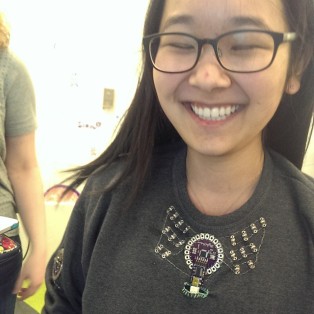
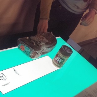
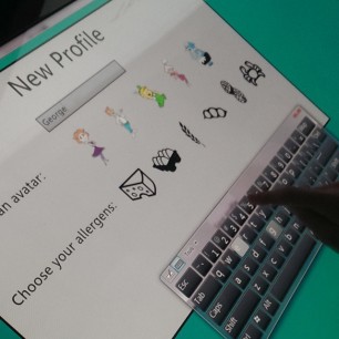
I presented an NSF funded project that is intended to help users capture, visualize, and engage with social omic data. Omic data is a comprehensive analysis of genetic and molecular profiles of humans and other organisms. There now exists novel methods for rapid DNA testing that allows users to receive omic data not only about their genetic information and their personal microbiome but also about the plants and animals they interact with. These rapid testing methods can detect dangerous allergens, undesired ingredients in processed food, and detect microbes that cause foodborne illnesses. Testing of living surfaces can also provide greater awareness of one’s environmental omic data. This environmental and nutritional omic data is of high social relevance. Consider a family or a group of people who share a living space. These groups are likely to share bacteria and this microbiota can be influenced by shared lifestyle elements such as pets and food. Within these groups, people might want to share information about the presence of allergens and of particular ingredients, compare personal and environmental data, as well as investigate changes in their own and environmental omic data following lifestyle and/or environmental changes (e.g. diet, new pet, seasons, new furniture). However, tools for aggregating, exploring, sharing and collaboratively making sense of such data are currently not available.

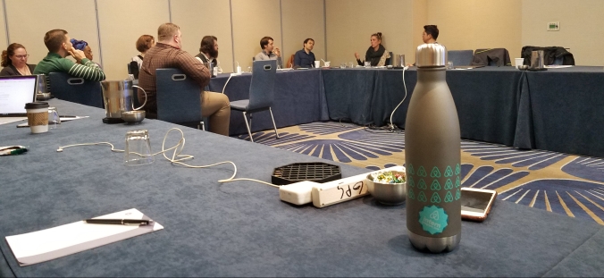
During this presentation, I was very nervous but the audience – full of assistant professors, PhD students and post docs were attentive and generous to an inexperienced research fellow eager to learn. The structure of the workshop was pretty small and intimate. We completed two rotating panel style discussions; one in the morning about the many technical dimensions on social engagement and one in the afternoon about  ethics, privacy, and the impact of social change over time. These panels were interspersed with presentations related to the nature of social engagement, data representation of networks, ethics, and privacy. The workshop provided the grounds for rich and insightful discussions on data representation of networks and the ethical and social tensions that can arise as these networks become increasingly more complex.

In the middle of this busy day, the workshop lunch at PiggyBack Bar, a southeast fusion waterfront venue, allowed me to take a more personal approach to understanding the motivations and goals of workshop colleagues but it also allowed me to field worthwhile advice from people who have gone the course in academia. By the way, the food was delicious. 10/10, would recommend.

20181105_094443

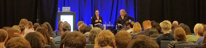
The following day, the conference opened with a keynote from Julia Angwin and Emily Ball, who spoke about the necessity of “adversarial” tech journalism and social computing research as a means to combating the “social climate change” which has been exacerbated by social technology giants such as Facebook, Twitter, etc. Ironically, I had my twitter opened to view the #CSCW as other attendees made their criticisms, agreements, and observations of this dialogue live to other attendants. As someone who neither caught everything they said nor did not know people there enough to directly ask for their inputs, I found that the twitter handle allowed me to engage with others and read their fresh perspectives on the keynote.

Tuesday was the last day I spent at the Conference. I spent the morning session attending talks concerning feedback sense-making, motivations in online communities, disclosure and anonymity on online forums and information sharing. I personally found the disclosure and anonymity forum to be the most useful in terms of how I should view the project I’m now leading as a research fellow. One thing I learned was that as much as going to every single talk is tempting, a premeditated and concentrated approach is my preferred style for conferences. For lunch, Professor Catherine Delcourt arranged a CSCW Wellesley lunch in the hotel. I had spent my time largely alone but It was great being able to connect with the Wellesley presence while at CSCW. This blend of professors, alums, undergrads allowed for a colorful exchange of experience concerning their research paths.

20181106_152336.jpg

After the end of the lunch, I attended Professor Orit Shaer’s talk on, “Understanding Collaborative Decision-Making Around A Large-Scale Table Top” led by past HCI research fellow, Lauren Westendorf in collaboration with Andrew Kun and Petra Varsanyi, and Hidde van der Meulen of UNH. Thus concluded my 1st CSCW experience and I can say that I found it to be a positive and inspiring experience due to the warmth and passion of the CSCW community, NSF funding, and the support of the HCI lab.

UIST 2016 Conference: Tokyo, Japan

This October, we traveled to Tokyo, Japan, to attend the ACM UIST (User Interface Software and Technology Symposium) conference.

We had an incredible time – the weather was beautiful and the conference was very well attended – registration was full! Because of our jet lag (13 hours ahead of Boston), we woke up very early and had plenty of time to explore before the conference began at 9:30am each day – including walking through the East Imperial Gardens and catching breakfast at the Tsukiji fish market (pictured below).

The conference opened with a keynote from Takeo Kanade, who spoke about the “Smart Headlight,” a project currently under development at Carnegie Mellon’s Robotics Institute. This research combines a camera and selective light projection to create a device that could “erase” raindrops or snowflakes from a driver’s field of vision on the road and allow continuous use of high-beam headlights without temporarily blinding other drivers. Dr. Kanade teased the audience claiming that current augmented reality applications that overlay objects on the image of reality (e.g. Pokemon GO) are merely an ”augmented display of reality,” while his device would manipulate how a user perceives their environment and in that sense constitutes “genuine” augmented reality.

img_8089

During the conference, we presented a poster on our own work in progress about understanding collaboration around large-scale interactive surfaces. We presented a novel method for analysis and visualization of joint visual attention data from head-mounted eye trackers collected from multiple users working around a multitouch conference table on a collaborative decision-making task.

Beyond presenting our own work it was also a humbling and inspiring experience to be among the UIST community and hear about their research. Coffee and lunch breaks offered spaces for informal discussion of research (not to mention great food), and the conference was packed with paper sessions and demos. Some highlights include VizLens, which makes control panels blind-accessible, Reprise: a design tool for specifying, generating, and customizing 3D printable adaptations on everyday objects, and ERICA: a system that supports data-driven app design with interaction mining and a user flow search engine. The conference ended with a visually stunning keynote by product designer Naoto Fukasawa who shared his design philosophy.

We asked one of the student researchers from the HCI Lab, Midori Yang  (pictured below at an owl cafe in Harajuku) who served as a student volunteer at UIST 2016 to write about her experience:

img_2816“I was incredibly fortunate to go to my first science conference as a student volunteer, and I had no idea what to expect. As a female undergraduate with no paper or poster to present, I was nervous about proving my place there and not making a fool of myself, even though I factually was a fool compared to the industry researchers and PhD students I met. But surprisingly, once I was at the conference, the gap in knowledge between me and these accomplished people was never a source of intimidation. The other student volunteers were incredibly welcoming and receptive to my questions about their research, never losing patience when I asked questions out of ignorance of computer science (I asked many of these questions). It was amazing to hear about the different projects they were developing, and what they were doing to make widen the spectrum of computer science’s applications, whether it was in medicine or the arts or a classroom setting.

The experience that had the strongest impact on me was of the student volunteer who immediately shared all of his research with me when it became apparent that it would help my own. I mentioned that my group for my TUI class was having trouble finding the hardware we needed to properly simulate the sensation of a guiding hand through a bracelet. The student volunteer’s demeanor seemed to change completely, coming into focus, and he told me that his lab had developed an entire glove for virtual reality with similar technology. He launched into a speech about the varying progress his lab had made, showing me demos and user studies and explaining exactly what materials I’d need to build my own glove. He didn’t seem at all concerned as to whether I’d credit him and his lab for their help; he was entirely concerned with making sure that I would be able to make progress and that I knew I could email him anytime with questions. After spending thirteen years as a student in highly competitive schools, I needed a reminder that I wasn’t absorbing knowledge just to raise my own grades and better myself, but also to share it with other people in my communities and better them as well. It finally occurred to me that the whole purpose of scientific conferences was the mass sharing of information in the name of scientific progress, and not a show of who had accomplished more in the past year.”

Gaming Futures: Perspectives of Women in Gaming and Play

Recently, Wellesley College was buzzing with video game events. The Davis Museum unveiled its exhibit The Game Worlds of Jason Rohrer, making it the first art museum to host a solo retrospective of a video game artist. Events surrounding the opening of the exhibit included a talk by Jason Rohrer, a student demo session of video games, and a panel discussion about the perspectives of women in games and play.

Student Demos

Demo night attendee crowd      MuSme in action

During the demo session, Wellesley College students showed off video games they designed and developed. In Asiya Yakhina’s mobile social impact game White Gold, players work as a cotton-picker in Uzbekistan. The purpose of the game is to raise awareness about the practice of forced labor in the country, and to draw connections between the reality of cotton picking and the impact that it has on the people. Meanwhile, Whitney Fahnbulleh’s choice-based textual game Privilege simulates the effects of privilege in daily life by letting players take on the role of an underprivileged individual making innocent decisions, such as whether to go to the store to pick up snacks, with potentially life altering consequences. Breaking away from traditional platforms and focusing more on play itself, MuSme (above right) by Amal Tidjani, Priscilla Lee, and Eileen Cho is a musical suit that allows children to use a skin suite on their body as a keyboard to create music.

Gaming Futures Panel Discussion

To extend the discussion of video games beyond the exhibit, the HCI Lab, in collaboration with Professors Orit Shaer, Dave Olsen, and Nicholas Knouf, organized the event Gaming Futures: Perspectives of Women in Games and Play, a panel dedicated to highlighting the experiences of women in the fields of video game research and development. Panelists included:

  • Katherine Isbister, a full professor in the Department of Computational Media at the University of California, Santa Cruz and core faculty member in the Center for Games and Playable Media. Her research focuses on the emotion and social connection of gaming.
  • Soraya Murray, an assistant professor of film and digital media at University of California, Santa Cruz. She is an interdisciplinary scholar who focuses on contemporary visual culture, with particular interest in contemporary art, cultural studies, and games.
  • Rayla Heide ‘10, a scriptwriter at Riot Games. She began her career at Celestial Tiger Entertainment Limited, where she was pitched original concepts for scripted TV shows and features, and tackled the enterprise’s production and marketing.
  • Cassie Hoef ’15, a technical program manager at Microsoft. She works with graphics developers on AAA games to deliver quality, performant games.
  • Claudia Pederson, an assistant professor of art history in new media and technology at Wichita State University. She studies modern and contemporary art, with a focus on technology, media theory, and social practice.
  • Anna Loparev ’10, a postdoctoral researcher at the Wellesley Human-Computer Interaction Lab. With experience in game design both in industry and academia, she centers her research on the intersection of collaboration, education, and play in next generation user interfaces.

The event attracted an audience from the broader Boston community. One of the major draws was the diversity of perspectives brought by the panelists. From academic halls to bustling board rooms, from scriptwriting to API development, from a recent college graduate to leaders in their field, from cultural to historical perspectives, each panelist presented a unique perspective that contributed to overall discussion in meaningful and impactful ways.

Panalists

After all of the panelists shared insights into their work and emerging topics in the fields of game design and development, audience members were encouraged to ask questions, sparking dialog among panelists and attendees. One of the most in-depth conversations centered on the meaning of art and whether a game can be art. The role of money in game development and its effects on a game’s artistic nature came up several times. Other comments from panelists centered on the question of what we are actually asking when we question games as art, as well as the parallels of this discussion with similar ones raised during the rise of other media, such as photography.  The consensus seemed to be that games can in fact be art, but judging whether a game is art or not is a subjective matter.

Another focus was on the industry workplace environment and how women are treated and perceived. Experiences varied, but overall panelists felt respected by male co-workers, despite working in a male-dominated setting. When discussing perception in the wider gamer community, sentiments were more pessimistic. Panelists agreed that there is no denial (and unfortunately no easy fix) concerning prevalent sexism in the community. The only practical course of action may be to simply bear it and try to develop as many positive female role models as possible. As Professor Murray put it, simply “standing in front of a class and speaking competently about games is an act of activism.”

After the panel, many members of the audience shuffled toward the front to talk to Scholarly books about video games
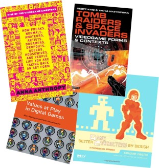
panelists one-on-one. Students were enthusiastic about the readings panelists had suggested and were eager to learn about how to enter the fields of video game design and development. Suggested readings included Rise of the Videogame Zinesters: How Freaks, Normals, Amateurs, Artists, Dreamers, Drop-outs, Queers, Housewives, and People Like You Are Taking Back an Art Form by Anna Anthropy, Tomb Raiders and Space Invaders: Videogame Forms and Contexts by Geoff King and Tanya Krzywinska, Values at Play in Digital Games by Mary Flanagan and Helen Nissenbaum, and Better Game Characters by Design: A Psychological Approach by Katherine Isbister.

While one panel will not necessarily fix the industry, it was successful in inspiring the audience to learn more about women in games and play and the issues they face. We hope that more women will join this space and set their own positive examples in the community, paving the way for a more welcoming and inclusive space.

SynFlo: Synthetic Biology Through Playful Interaction

SynFlo is a new project that began this semester in an effort to further explore the role of technology within the domain of synthetic biology. This tangible user interface seeks to convey basic synthetic biology concepts to a diverse audience of children and families in an informal science learning setting. SynFlo mimics a wet-lab protocol used in a real synthetic biology experiment. It uses small micro-computers (Sifteo Cubes) with dynamic actuation and display capabilities, which are mounted onto 3D-printed labware such as petri dishes and beakers. The project team is advised by Prof. Orit Shaer and consists of Evan Segreto ’15, Casey Grote ’14, and Johanna Okerlund ’14, in collaboration with Anja Scholze and Romie Littrell from San Jose’s Tech Museum of Innovation.


34ozk3p

sifteo cubes with gene, plasmid, & e. coli

SynFlo was originally conceived as an outreach project for iGEM 2012 as an interactive installation that walks participants in an outreach science program through the basic steps of E. chromi: an experiment conducted by the University of Cambridge iGEM team, involving the creation of E. coli that serve as color-changing biosensors. The installation consisted of three main parts: a triplet of Sifteo cubes, a triplet of tangibles, and the Microsoft Surface. The Sifteo cubes represented the genes, plasmid, and E. coli, respectively; the tangibles represented the toxins; and the Surface acted as an environment in which to deploy the engineered bacteria. Users progressed through a simulation of the E. chromi experiment as they would in the wet lab.

2hdo65w

toxin tangibles & microsoft surface

First, users choose the gene to be used in the experiment, by tilting the cube to scroll and pressing to select. Then, the gene is inserted into the plasmid, which acts as the vehicle for insertion into the E. coli. Users do this by neighboring the gene and plasmid cubes and shaking, simulating a vortex mixer. Finally, the plasmid is inserted into the E. coli by neighboring the plasmid and bacteria cubes. Users can then test their creation by deploying the bacteria within the Microsoft Surface and adding various toxins.

A user floods the environment with a yellow (lead) toxin by touching the tangible to the Surface.

More information regarding this first version of SynFlo can be found here.


The second iteration of SynFlo began in late January as a collaborative effort between the Wellesley HCI Lab and the San Jose Tech Museum of Innovation, after we were contacted by two members of the Tech’s research team, Romie and Anja. They were looking for extant examples of interactive applications to teach children basic synthetic biology concepts and happened to stumble across documentation of the version described above. In collaboration with Romie and Anja, we began work on implementing a new version of SynFlo–one that would work on the new Sifteo SDK (2.0) and would incorporate more tangible elements. The most recent version of the application, with which we ran preliminary user studies with visitors at the Tech, looks like this:

We tested two different implementations of SynFlo: (1) Sifteo cubes alone (which is similar to the original SynFlo implementation) and (2) Combining Sifteo cubes with 3D-printed tangibles and labware. Thus, there are two ways to interact with the system for each step of the experiment.

pick

helixes representing genes

STEP 1. Users select their desired gene. This step does not differ much between versions–in one, users select the tangible representation of their gene, and in the other, users select the Sifteo cube containing the digital representation of their gene.

STEP 2. Users insert the gene into an empty plasmid. In the labware version, they insert the DNA strand into the plasmid beaker. In the other, users simply neighbor the gene and plasmid cubes. In both versions, users shake the gene and plasmid to simulate vortexing.

pouring plasmid into petri dish

pouring plasmid into petri dish

STEP 3. Users insert the plasmid into the E. coli.The labware version requires users to “pour” the plasmid into a petri dish containing the E. coli. Similar to the step above, users neighbor the cubes in the cube-only version.

STEP 4. Users test their E. coli. Using the labware, users “pour” beakers of toxin into the petri dish to introduce the substance to the E. coli’s environment.  Using the cubes alone, users neighbor toxin cubes with the E. coli cube to test for a reaction.


In general, we found that large tangibles help to attract users–the labware drew people over in a way we didn’t see when working with just the Sifteo Cubes. Visitors also spent more time engaged with the tangible version and seemed to remember the process, often repeating it for all the available genes. On average, users who interacted with the tangible representations spent 6.3 minutes engaging with the system: 2.6 minutes more than the 3.7 minutes spent on the cubes alone.  Visitors who were watching (and not interacting directly) seemed to find the tangibles more interesting as well, spending more time engaged with watching than with the cubes only.  Perhaps most importantly, we asked several  children which version they would prefer, and they all indicated a preference for the tangible representations, saying that they made the interaction better, using words like “fun” and “interesting”.

Although the semester is coming to a close, we have big plans for the future of SynFlo. Evan Segreto is presenting a poster on the project at the Wellesley College Computer Science Department’s annual Senior Poster Session. This summer, with our new iGEM 2015 team co-instructed by Orit, Romie, and Anja, we’ll be exploring the interaction space of the Multitaction Surface to supplement our existing tangible prototype and to develop new interactive experiences for communicating synthetic biology to the general public.

TEI Conference at Stanford

A few weeks ago, we traveled to Stanford, CA for the TEI (Tangible, Embedded and Embodied Interaction) Conference. We had a blast – aside from enjoying the beautiful and warm California weather, we were stanf
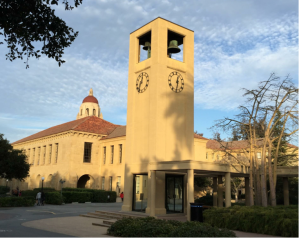
introduced to a variety of interesting projects and frameworks through the paper talks and demo sessions. Stanford’s campus was definitely one to marvel at, with the red roofs and sandstone colored walls.

The conference opened with a keynote by Frank Wilson, who spoke about the history of the human hand and its relevance to the world of tangible and interactive technologies. The human hand is important, not only from a functional standpoint, but also personally. We use our hands from the moment we are born to start exploring and discovering the nature of the physical world. Our hands are arguably the most direct way to interact with and understand physical objects in front of us. The way young children use their hands to touch, poke, rub, hit, and trace objects is insightful to the nature of all our interactions with the physical world. This also makes our hands an important part of our identity. It is inspiring as an interaction designer to think about our relationship with our hands, but also an important research question to think about how to design for people who don’t have hands.

During the conference, we also demoed and presented our own project, Eugenie (shown below), a system that combines tangible active tokens with a multitouch surface to support biologists in a process for bio-design that involves forming complex queries and exploring a large dataset. Users build rules with the physical tokens and then stamp the rules to the surface, where they can explore and interpret the results. The goal of the system was to explore how tangible interaction can be applied to collaborative experiences for dataset exploration. Many people were interested during the demo session in the block-like structure of the pieces and even some children were compelled to explore the pieces themselves.

eugenie1eugenie2

We also had three students from our TUI Fall 2014 class present their final project, the Emotisphere (shown below), during the TEI poster session. Using an Arduino, galvanic skin sensors, and a heart-rate monitor, this project connects emotion and music. The sensor information is interpreted as an emotion and generated into a song. The sphere itself can be manipulated in different ways (shaking, twisting, rolling) to control various aspects of the music (volume, changing songs, etc.). The attendees seemed to enjoy learning about and playing with the Emotisphere.

emot1 emot2

It was empowering to come to the conference with our own research to present, but it was also humbling to be among so many amazing people and hear about their interesting research. The rest of the conference was packed with paper talks and demo sessions. The presentations covered everything from analysis frameworks to the latest projects incorporating new forms of interaction. A few unique applications included MugShots, which allows for social interaction in the workplace by adding a small display to a mug; PaperFold, which uses thin-film foldable displays to give users a new way to interact with digital “paper;” VoxBox, a tangible machine that helps solicit feedback from event participants; DisplaySkin, which offers a novel approach to wrist wearables by utilizing pose-aware displays; and SPATA, a spatio-tangible measurement tool that connects virtual design environments with the physical world.

One of the most interesting demos was a toy remote control car that was controlled by a smaller toflower
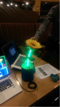
y remote control car. You would drive the smaller one around and the larger one would drive in the same pattern. It was such a simple idea, but it makes so much sense. Rather than having to mentally translate the desired path of the car to the left-right/ forward-back switches of typical toy car remotes or even having to translate it to the motion of a steering wheel, you could just imagine the path of the car and it would happen. One of our other favorite demos was a light-up flower (pictured on the right) that is connected to sensors in the user’s chair. The idea is that the flower sits casually on the user’s desk and droops and turns red when they have bad posture. It’s a fun and ambient reminder to have good posture.

The conference closed with an inspiring keynote by Wendy Mackay that was all about paper. She started by sharing many of the projects she’s worked on that were systems inspired by paper-based interactions. It’s interesting that the design principle for the most common computer operating systems is a desktop. There are documents and pages that can be layered, neighbored, or put away when not in use. It’s a powerful metaphor and it makes sense- we are used to working with a physical desktop and we would want our digital environment to be familiar to us. However, many people seem to be working towards digital systems that could completely replace the physical desktop with a digital one, and this is probably not the best approach. If this were to happen, we would lose many of the personal and intimate interactions we have with paper. One example of this Wendy mentioned was how composers notate their compositions while they are in the process of composing. Everyone has a slightly different system that makes sense to only them, and also the symbols they develop naturally take on different meanings based on not only where they are written, but how they are written. It is hard to have computer systems that allow for such personal and unique interactions. So based on all these reasons, Wendy suggests that rather than creating digital environments to replace the physical ones we have always known, perhaps we should rather strive to introduce computation to the physical environments to enhance them and enrich the interactions. Rather than trying to replace the physical world, we should be celebrating it and leveraging our established interactions with it.

Overall, we had a wonderful time at TEI sharing our projects from the HCI Lab and learning about the research practices and projects in the world of tangible, embedded, and embodied interaction. We were inspired by the work and conversations we had with many brilliant computer scientists, artists, and philosophers. The energy from the conference was contagious and we are excited to continue our work in the lab, incorporating some of the energy and inspiration from the conference.

CS320: Tangible User Interfaces FINAL PRESENATIONS !!!

The students from the CS230 class, Tangible User Interfaces, had their final presentations of their interfaces on Monday;

IMAG0354

Check out the cool things they made!

Emotisphere

Audience – all people
Goal – Connect emotion and music
Sensors – galvanic skin sensors and heart-rate monitor
Hardware –  arduino uno


Emotisphere senses users emotion through biological reactions and translates into appropriate music. Interaction techniques like twisting for volume control are based on the affordances of spherical objects. In future work they will create more interaction (like changing songs,) identify a wider range of emotions, and create algorithms to generate musical compositions programatically based on bio-rhythmic data.

They will be presenting their work as a Works In Progress paper at TEI2015! 

Team Musical Hoodie

Audience – all people
Goal – to share the music one is listening to with the world and show visually the type of music being heard.
Sensors – temperature sensor
Hardware – lilypad arduino, capacitive thread


Lights on hoodie flash with the music to create a social music experience. A temperature sensor on the arm also functions as a touch sensor, to help make the experience more interactive for users outside the sweatshirt.

Do you ever find yourself listening to music but people find you anti-social? Have no fear, Musical Hoodie is here! The MH team created a musical hoodie with a Lilypad and leds. Lights on the sweatshirt flash with the beat of the drums in whatever song the user is listening to so the people around you know what your mood is while you have headphones in. Another feature is that when someone taps the sweatshirt on the shoulder, a temperature sensor senses this and lights up the sensor on the shoulder.

teacher inTUItion

Audience – elementary school children/teachers age 7-13
Goal – allow students more direct communication with the teacher
Sensors  – sliders, buttons
Hardware –  phidgets

The inTUItion team interviewed current teachers and students and created a device to poll students for answers, share emotions and evaluate level of understanding; They also created a web interface to aggregate information for teachers; each student has a profile with info about their emotions. They web interface also allows a teacher to give feedback to students to quiet down, listen up, 2 minute warning.

Elementary school students have a wide variety of social and emotional learning needs. It can be difficult for some students to communicate with their teachers and it can be difficult for teachers to monitor all of their students at once. teacher inTUItion allows students to indicate to their teachers their emotion levels (sad/frustrated to happy) and their understanding levels (green for understanding, yellow for confused, red for totally lost). Teachers can provide feedback to students by clicking a button that will light up the class if they should quiet down, listen up, or if students need a 2 minute warning for finishing an assignment. Each student in the class has a profile which the teacher can monitor online to dynamically change their teaching for the students. 

Calvin Calendar

Audience – families, especially those with children and working parents
Goal – preserve handwriting element of schedule planning and integrate with digital calendar software
Hardware – LiveScribe pen, Microsoft Surface


Calvin Calendar creates seamless integration between livescribe+pen interaction and surface+touch interaction. This integration allows users to remotely upload things onto a central calendar for the whole family. This creates and experience os personal and intuitive planning for families

In the backend, Calvin Calendar uses livescribe to upload to evernote where they are saved as images, and regularly fetches these notes to the surface application to be arranged.

As families grow, it can be increasingly difficult to coordinate and keep track of everyone’s schedule. People have both handwritten and digital calendars, but they are not usually in sync. Calvin Calendar aims to seamlessly integrate the handwriting and creativity from planners and the digital convenience of things like Google Calendar. By using a LiveScribe pen and a Microsoft Surface, families can keep a central calendar in the home that is dynamically updated. Family members can write each other notes with the LiveScribe, have the information for themselves, and they would not need to manually sync it up with their digital shared calendar. 

Allergen Aware

Audience- families/groups of people have a lot of dietary issues
Goal – Help prevent cross contamination in shared cooking spaces
Hardware – Microsoft Surface


Surface application allows you to create profiles for people with allergies, add fiducial tags to the allergens, make groups of people to see all allergens at once After choosing groups of people to cook for, one can put ingredients on the surface and the fiducial tags will turn the surface red if the ingredient is unacceptable for that group of people. You can check the history of the surface to see if something was recently made on the surface that could trigger a reaction. 

Friends and family frequently share a meal together, but there are often allergens that can complicate cooking meals. When cooking for people with allergies, it is important to be careful that the cooking surface is not contaminated. With Allergan Aware, a Microsoft Surface provides the means to avoid triggering reactions. Allergen Aware allows you to create profiles for friends and family indicated their dietary restrictions. Each person can be added to a group so one could quickly select the group and import all of the restrictions to the surface. When cooking, foods with fiducial tags are set on the surface. If a food contains a dangerous allergen, the surface turns red to indicate that this is a problem. The surface retains a history of the most recently used allergen on the surface so the next user can be aware that they may need to be cautious. 

NutriGlass

Audience – initially children, but extended to adults
Goal – Make kids (and adults) excited to eat healthily.
Sensors – photo interrupter
Hardware – Kinoma, Google Glass

NutriGlass is a two part project, starting with an interface developed for the UIST student innovation contest: BenTUI Box.

BenTui Box used a Kinoma to create an interactive lunchbox to help kids develop good eating habit.
Photo interrupters can sense when there is food between them and then when you eat the food, it would light up and be fun.

After UIST this project moved to google glass and the audience shifted to adults.
Using image recognition glass will overlay information onto your food to give information on the nutritional benefits of the things you are eating. 
Your current progress through your daily nutrition requirements is presented to help users make healthy choices.

The first stage of this project, BenTUI box, was presented at UIST 2014!

TreadLight Timer

Audience – people who like to cook
Goal – simplify timers by creating a easy to see and use timer interface
Sensors – eventually plan to include force sensor or button to detect kick-start
Hardware – Kinoma, plenty of LEDS


When cooking, different devices spread out over the kitchen need their own timers and need to be kept track of. Currently, timers require you to be standing in front of them to check and see how much time you have left. TreadLight Timer addresses these issues by indicating the progress of cooking food with ambient colors and light. The lights change from blue to purple to red as the timer counts down, indicating how close to finishing the food is.

This project was presented at UIST 2014!

EUGENIE++: Exploring Tangible & Gestural Interaction Techniques

From Minority Report, a fictional–but very awesome–depiction of a gestural-interaction based system.

How are you interacting with this webpage right now? Chances are, you navigated to this page by typing on a keyboard or clicking with a mouse; you may have used a touch screen–a simple example of tangible interaction. Generally, the range of computer interaction methods available to you isn’t very broad; you can use touch or a mouse, but they both involve selecting and “clicking”.

The Eugenie team’s goal is to expand and build upon these methods by designing, testing, and evaluating new interaction techniques: ways of inputting and manipulating data that extend beyond ubiquitous mouse- or touch-based systems.

Google Glass, a real system that uses tangible, gestural, and audial input. (Our lab works with these, too!)

This summer, we focused on exploring new interaction techniques using active tangible tokens–physical objects that can sense and react to changes in their environment and to the ways in which they are manipulated. For example, a mouse, while tangible (i.e. you can hold it in your hand) is not active: it doesn’t change in any way based on how you use it. For active tokens, we used Sifteo cubes, which are small micro-computer blocks that have screens and sensors that can detect their orientation, rate of acceleration, and proximity to one another.

Sifteo cubes, our active tangible tokens.

In addition to the Sifteo active tokens, we also 3D printed passive tokens to act as constraints. The 3D printed blocks served as casings for our active tokens; we designed them to hold the Sifteo cubes without obscuring the screens, and to implicitly convey information about how the tokens should be used.

In order to develop and test interaction techniques involving tokens and constraints, we decided to build upon a design tool that we developed last year for the synthetic biology competition, iGEM. The application, Eugenie, which won a Gold Medal at iGEM 2013, is (put simply) a multi-touch application that allows synthetic biologists to (1) explore and search for biological parts from multiple databases, (2) specify structure of biological constructs, (3) specify behaviour between biological parts and/or constructs, and (4) view and prune results. To support collaboration, we created the application for the Microsoft SUR40 (using C# and the Surface SDK 2.0).

Below is a short video of Eugenie:

We added interaction with Sifteo cubes and 3D printed parts to Eugenie to create a second version: Eugenie++. The tangible interface replaces the first (exploration) and second (specification of structure) phases of the Eugenie application.

In the exploration phase, users interact solely with the Sifteo cubes. Our Sifteo application contains a small database of common biological parts. By tilting the cubes, users may scroll through a given category of parts. Neighbouring the cubes vertically allows users to view more specific categories (e.g. neighbouring cube B under cube A–which displays “promoters”–would load a subcategory of promoters in cube B). Pressing the screen locks a part to the cube: until the cube is re-pressed, it is associated only with the shown biological part.

In the specification phase, users combine the Sifteo cubes with the 3D printed blocks to specify structure. For example, to create a “NOT X” relationship, the user combines a cube containing the part X and a NOT constraint. The constraints are designed to implicitly limit user error; the blocks have puzzle-piece-like extrusions and indents that only fit together in certain ways.

Users interact with tokens and constraints on the Surface bezel.

Users interact with tokens and constraints on the Surface bezel.

Once the user finishes defining the structure using the blocks, they then “stamp” the construct onto the Microsoft Surface. The SUR40 uses computer vision and can therefore detect certain shapes, patterns, and objects. The cubes and constraints are attached to byte tags, a patterned image that corresponds to a given object. Eugenie++ uses this information to determine the structure of the object placed on the Surface, and it adds this to the ruleset accordingly.

Here’s a video of the Eugenie++ project’s conception and development, from start to finish:

Preliminary user-testing revealed that our interface was fairly intuitive, with most users intuiting the behaviour and meaning of the constraints from their physical characteristics. Most users also reported finding the experience fun and informative.

We published a work-in-progress extended abstract and presented a poster of our results at UIST 2014 in October. We are also excited to announce that a peer-reviewed paper of our results was recently accepted to TEI 2015!!

Stay on the look-out for future posts about our experience at UIST, as well as TEI in January 2015.

UIST Student Competition

We brought 3 different projects to the UIST student competition this year. Every year, the competition is centered around a piece of new technology that students are challenged to think of creative and interesting uses for. This year, the technology was the Kinoma Create, an arduino-like board with sensor inputs and outputs as well as a touch screen and web capabilities all built-in. Programs for the Kinoma are written in JavaScript, lowering the barrier for people who have never used pins before to make interesting hardware systems.

The Kinoma fits in well with an HCI concept called the Internet of Things. If you think of the regular Internet as a bunch of connected pages of digital information, then the Internet of Things is the same, but with physical objects. It is about physical objects knowing information about other physical objects, controlling other objects, knowing information about the environment or from the web, communicating that information, and acting based on that information. Because of the sensor and web capabilities of the Kinoma, it lends itself well to adding objects to the Internet of Things. The student competition from UIST required us to use the Kinomas to invent something for the kitchen or general household.

The competition inspired us to think about our vision for the smart kitchen of the future. If we could build a kitchen from scratch, what would that look like? Our vision is grounded in the Internet of Things. We imagine ways that appliances and objects in the kitchen can know information and how that can help the inhabitant. The kitchen could know information about the outside world, such as the weather of the day or traffic reports, and could communicate that information to the inhabitant as well as help them adapt. The kitchen should also be aware of what is in it and what comes and goes, much like how a vending machine keeps track of what’s inside it. Interactions with vending machines are much too stiff to model our home fridges after, but you can’t help be envious of how much the vending machine knows about its contents- what’s in it, how much of each thing, and additional information about each item, such as cost. The entire kitchen could work like that with knowledge about the objects in it and how they are being used.

We developed three projects that are consistent with this vision of a smart kitchen: Weather Blender, TreadLight Timer, and BenTUI Box.

Weather Blender

Screen Shot 2014-12-05 at 3.08.37 PM
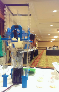
Weather Blender, as it’s name suggests, is a blender that tells the weather. Based on the weather report for the day, Weather Blender produces a smoothie that reflects the forecast. Weather Blender consists of a blender and a container with four compartments that hold different types of fruit. In our configuration, we use strawberries, mango, banana, and blueberries. When the user wants a smoothie, they press a button on the Kinoma, which gets the weather from the web, generates a recipe, and uses motors to control flaps in each container, allowing the correct proportion of each type of fruit into the blender. For example, if the weather is rainy, a blue smoothie is produced. For sunny weather, we chose to use orange. Clouds are banana, and warning weather is strawberry. For example, on a day that is hot and sunny, the smoothie will be mostly orange, with a bit of red.

Weather Blender is a cool way to explore the possibilities of smart appliances in the kitchen. They can be useful from an information display standpoint- they can use ambient means to communicate to the average human information about the environment and the world beyond. Rather than having to read a weather report, wouldn’t it be much easier for the user to just know the weather based on the smoothie you are drinking anyway. Smart appliances can also help people adapt based on the state of the world outside. For example, perhaps the Weather Blender sneaks some Vitamin D into the smoothie on a rainy day since it knows the human will be lacking sun. See our concept video here.

BenTUI Box

Screen Shot 2014-12-05 at 3.05.58 PM

BenTUI Box is about inspiring kids to eat healthily by giving them an interactive lunchbox. When they eat all the food out of a given compartment, that compartment lights up. It gives children an incentive to eat all their food rather than leaving it in their lunchbox and bringing it back home.

The BenTUI Box demonstrates the Internet of Things because the system gives the lunch box knowledge of what’s inside of it and the lunchbox reacts differently based on how its contents change. The system allows people to interact with a lunchbox in novel ways and demonstrates how a technological intervention can encourage kids to eat healthily. It is a step towards our vision where the entire kitchen knows what comes and goes and can help keep the inhabitant monitor a healthy lifestyle. See our concept video here and a video of our implementation here.

TreadLight Timer

Screen Shot 2014-12-05 at 3.03.31 PM 
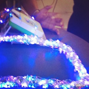
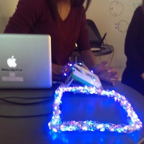
The TreadLight Timer is a system that aims to provide more ambient and easily accessible information to someone cooking in a kitchen. The timer leverages the fact that there are really only 3 different states of the timer the cook is interested in: The food is no where near done, the food is almost done, and the food is done. The system uses a string of colored lights around the cooking apparatus to communicate the state of the timer ambiently, reducing the need for the cook to walk around the kitchen to locate a centralized timer and spend time reading and interpreting the numbers on the tiny display.

The TreadLight Timer illustrates the use of ambient information to reduce the number of things a user has to think about during a cognitively demanding task. It also centralizes the information closer to where the task is taking place, using previously unused space in the kitchen as a canvas for information. This presentation of information allows a clearer mapping between processes and tasks if the user has multiple things going on. For example, when cooking multiple dishes, the user can have a TreadLight Timer on for each burner on the stove. In our vision of the smart kitchen of the future, the stove would have such a timer built into each of the burners as well as the oven and other appliances that a kitchen-user might want to time.

In conclusion, these projects explore ways in which kitchens can be smarter in terms of the information they have access to, ways they act on that information, and how they communicate to the inhabitant. We are excited to imagine further possibilities for a smart kitchen.

Privacy and HCI for Personal Genomics

While considering HCI perspective on personal genomics, we partnered with the Personal Genome Project. The nature of the Personal Genome Project (PGP) as an open source online database of personal genomic information raises important questions regarding a participant’s privacy and willingness to share their information publicly. The PGPHCI team, led by Orit Shaer, in collaboration with Dr. Oded Nov (NYU) and with Dr. Darakhshan Mir (Wellesley College) investigates privacy and sharing in the context of personal genomics.

Screen Shot 2014-08-19 at 4.34.00 PM

While conducting an intensive literature review of the field, student researcher Claire Cerda, led the team to discuss how people have unique attitudes and behaviors when it comes to maintaining their privacy and security. Such behaviors include clearing cookies from a browser before logging off of the computer, or covering the keypad when entering a pin number connected to a debit card. Some people are very concerned about having their credit card information stolen when they pay for products online, but some are more trusting in the system. These attitudes and behaviors may vary based on a person’s technical skill or a person’s age, for example. In order to better understand user’s attitudes and behaviors regarding privacy, the team implemented a privacy index developed by psychology Professor Tom Buchanan of the University of Wesminster. Buchanan’s privacy index builds upon the work of the well-respected scholar Alan Westin, who was one of the first to study privacy and develop a way of measuring people’s feelings and behavioral patterns. Buchanan included more technologically relevant questions about the internet and online personal security that was not fully available during Westin’s time. The Buchanan index is made up of three separate scales: a privacy concern scale, a technical protection scale, and a general caution scale. The privacy concern scale measures a person’s attitude and the technical practice and general caution scales measure a person’s behavior about privacy and security. The PGPHCI team tested the scale among six individuals. Check out the results of our pilot study below. The graph presents a score between 0-4 on three privacy dimensions for each of our 6 pilot participants.

Screen Shot 2014-08-19 at 4.35.56 PM 

From the pilot test, the team was able to assess the effectiveness of the index and also understand its capabilities in an online survey.

The team also explored the risks and benefits of sharing personal genomic information among different circles of people. For example, the risks and benefits of sharing personal genomic information with family, friends, scientists, or on social media. The team will test whether making users aware of the risks and benefits of sharing will positively influence the amount of data they are willing to share. The study will continue in the next upcoming months, and the PGPHCI team looks forward to presenting its work at future conferences. Stay tuned for more information…

Summer Program Ending but zSpace Team Still Going On

Basic functionality has been implemented!

Basic functionality has been implemented!

With Wellesley’s Science Center Summer Research Program coming to a close, the zSpace team members are taking a moment to asses the current status of their two projects as well as reflect on the trials and tribulations encountered over the summer.

Following a brief stint of time where the fNIRS machine was not working due to a timer issue, Cassie and Jasmine have resumed running user studies. The issue that caused a pause in the this project is one both team members had taken note of before and has been a recurring problem throughout the summer. Unfortunately the timer is an integral part of the fNIRS and while an attempt was made to fix it early in the course of our research, the fix has proven just as unreliable as the machine. During the course of the summer the fNIRS developed a history of not working on Mondays, erratic signal strength due to poor headband (what holds the sensors to a user’s forehead) construction, and overvoltage signals for no apparent reason. Getting the finicky fNIRS to work in conjunction with zSpace proved to be a trial in patience this summer. While sometimes finicky as well, the zSpace proved to be more reliable than the fNIRS though we still ran into a few problems, the biggest of which were unexpected program shutdowns in the middle of user studies. Despite the setbacks and issues with both systems, the zSpace team is still on track to submit a paper to CHI 2015. In the mean time, we’ve created a poster to present some of the current findings of the brain study in the summer research program’s poster session this week.

A lot of progress has been made with MoClo Web Planner since the zSpace team’s last post as is evident by the image included in this blog post. The web version of the surface application has nearly full basic functionality implemented. A new custom theme has been implemented, draggable panels allow users to switch between levels, all parts in Level 0  (stored in the different tabs) can be dragged into, and only into, the correct boxes in Level 1, Level 1 has a combine feature that puts the parts together in different permutations, and any combined part sequence can be dragged into Level 2. Or in salad terms as Cassie is the one that has been figuring out the functionality: In Level 0 a user can select the parts of the salad that they have on hand and place the different food items in the correct boxes in Level 1. The button in Level 1 shows the user all of the possible salads that they can make, and then any number of those salads that seem appealing in Level 1 can be dragged into Level 2. The issues we’ve run into while creating MoClo Web Planner largely stem from learning jQuery on the fly and odd properties of various constricts we’ve implemented for functionality purposes (most notable of these is getting z-index to work in a way that would allow users to drag parts from one panel to another and have parts being visible above the new panel while in the process of dragging). Today the team met with our Boston University collaborators and discussed where we should now focus our energies as well as what functionality of the original MoClo Planner is most important to them.

Even though the program draws to a close, the zSpace team isn’t done. Both Cassie and Jasmine will be continuing to work on the brain study and MoClo Web Planner through August and likely into the school year.